User Research · Product Design · Prototyping
BucketList
An iMessage plugin that helps plans finally make it out of the group chat — turning “we should totally do this!” into dates on the calendar.
Company / Client
School Project (UW MHCID)
Duration
6 weeks · Nov – Dec 2025
Team
5 HCI Master’s students
My Role
UX Researcher, UX Designer
Skills
User Research, App Design, User Testing, Prototyping
Deliverable
Interactive prototype of an iMessage plugin
The 30-second version
TL;DR — for the skimmers (I see you)
Group chats are where plans are born — and where they quietly die. BucketList lives inside iMessage, catches plan-worthy ideas the moment they spark, turns them into a shared bucket list, and nudges the group from “someday” to “Saturday, 9 AM.” I worked across the full arc: competitive research, interviews, synthesis, ideation, prototyping, and two rounds of user testing.
6
weeks, concept to hi-fi
10
user interviews
9
usability sessions
6
competitors analyzed
The core idea in one loop: an idea sparks, gets buried, BucketList catches it.
The problem
Plans are born in group chats. They also die there.
Group chats have become the default place where plans happen — trips, restaurants, concerts, someday-adventures. But coordinating several people takes effort, follow-up, and someone willing to chase everyone down. So most ideas sink into chat history within minutes of being celebrated. Everyone says “yes!!” — and no one opens a calendar.
The gap isn’t enthusiasm — it’s the missing bridge between conversation and commitment. Plans get discussed, but never tracked, prioritized, or acted on.
The design brief
A lightweight planning experience inside the conversations people already have — no new app to adopt, no new habit to build, and no one stuck being “the planner” forever. Built to help everyone follow through, including users who struggle with attention and task management.
Research
Before designing anything, we found out exactly where plans break.
We grounded the direction in evidence before committing to a concept — mapping where existing tools fall short, and building a clear picture of the people we were designing for.
Mapping the market
I collaborated on defining the evaluation criteria and metrics used to assess 6 competitors — which surfaced clear market gaps: existing tools either live outside the chat (and get forgotten) or organize tasks without any social glue.
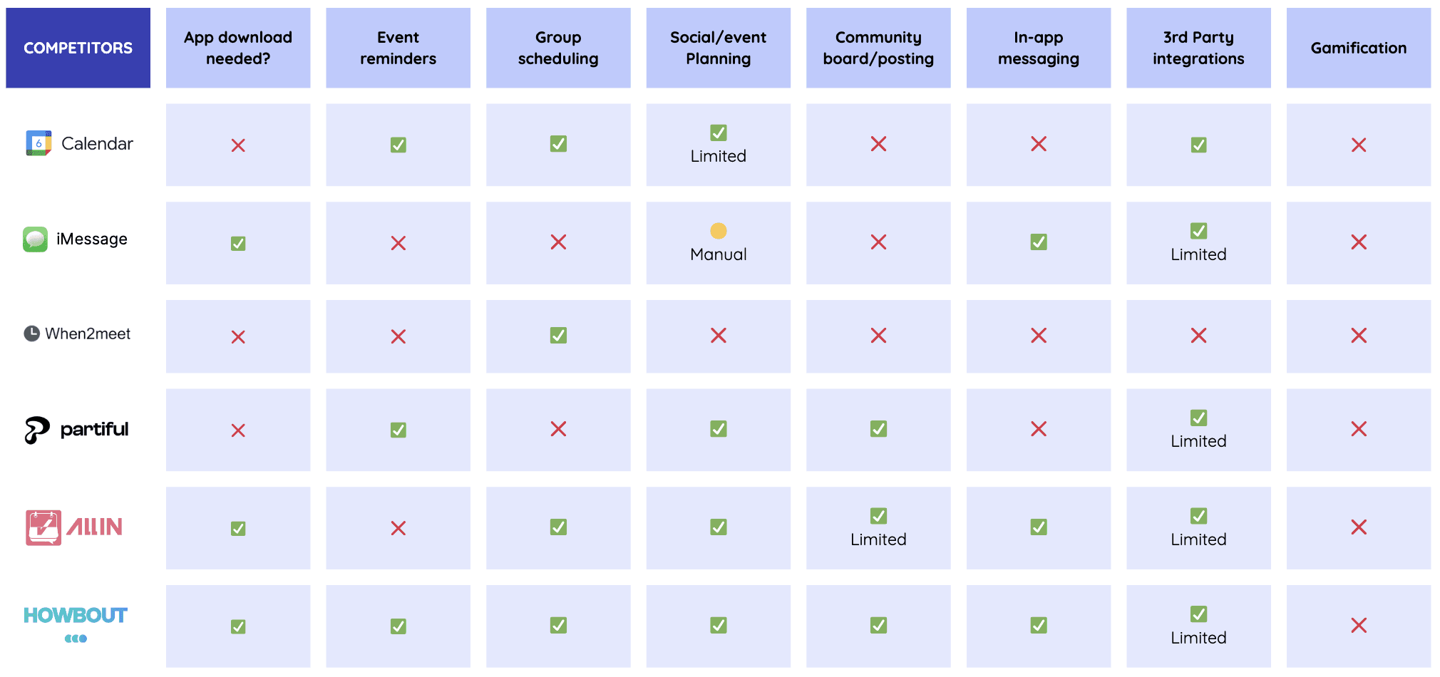
Competitive analysis across 6 products
Listening to real planners
I co-developed the interview guide and personally conducted 2 of our 10 interviews (ages 22–28, including participants who self-identify as having ADHD). We dug into real planning behaviors, collaboration habits, and the exact moments where follow-through falls apart.
Turning 10 conversations into direction
To make the research actionable, I helped synthesize the findings into an empathy map, an affinity map, and two personas — and hand-illustrated the user journey map so the team could see every friction point at a glance.


Empathy map · Affinity map

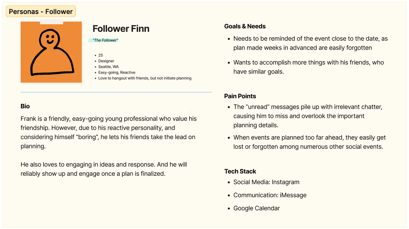
Two personas: the enthusiastic idea-starter and the overloaded default planner

The user journey map I hand-illustrated — friction points led to five core insights
What 10 interviews boiled down to
1
Plans get lost in the scroll
Ideas vanish into chat history, and nobody remembers to follow up.
2
Casual beats calendar
Friends prefer spontaneous, low-pressure hangouts over rigid scheduling.
3
Nobody wants to be the planner
Organizing feels like unpaid project management — and it always falls on the same person.
4
Reminders are what make people show up
Nudges and updates are the difference between “sounds fun” and actually being there.
5
Planning should feel shared, not stressful
Simple and social wins. The moment planning feels like work, people check out.
Design implication
People want a centralized, social space for planning that keeps the ease of the group chat — but adds organization, shared reminders, and low-effort coordination.
From insight to feature
Every feature answers a finding.
We didn’t design features we liked — we mapped each validated pain point to a product decision. Left: what we heard. Right: what we built.
Problem · key insight
Ideas vanish into the scroll
Plans are discussed and celebrated — then buried 40 messages later. Nobody follows up.
Solution · product feature
Smart Plan Detection
BucketList spots planning intent in the conversation and offers to save the idea or start a plan on the spot — before it gets lost.
Problem · key insight
Finding a date kills the plan
Scheduling threads go in circles. “When works for everyone?” is where momentum goes to die.
Solution · product feature
Availability Finder + Polls
Synced calendars show who’s free on which days, and the chatbot runs date votes right in the thread — no twenty-message back-and-forth.
Problem · key insight
Nobody wants to be the planner
One person ends up doing all the organizing — and quietly burns out.
Solution · product feature
Choose Your Role
The bot guides the group to pick AI-generated roles — each person owns one slice of the trip, with its own to-do list and rewards for finishing.
Problem · key insight
Without nudges, plans fizzle
Even confirmed plans fall apart without reminders — especially for users managing attention differently.
Solution · product feature
The BucketList Chatbot
Event reminders, milestone nudges, and event-card previews keep the plan visible in the chat — no digging through the plugin to stay updated.
Problem · key insight
Planning feels like work
When organizing feels like a chore, engagement dies between events — and the bucket list gathers dust.
Solution · product feature
Sand Dollars + the Starfish
Completing tasks earns Sand Dollars to unlock avatar customizations, and the Starfish reveals bucket-list overlaps with friends — sparking the next plan. This grew out of a “lottery bucket” idea I pitched in ideation.
Process, pivots and testing
The tool broke. The process didn’t.
Days before our first round of testing, we discovered our mid-fi prototype tool — Whimsical — couldn’t do interactive prototyping or even export screens as images. Rebuilding from scratch wasn’t an option on our timeline. Here’s how we recovered.
Step 1 · The roadblock
Whimsical turned out to be a wireframing tool only — no interactions, no image export. Testing week was already on the calendar.
Step 2 · The options
I proposed two recovery paths: rebuild the flow in Figma using linked screenshots — or print everything and run a paper prototype.
Step 3 · The call
We chose paper — and not just for speed. An unpolished prototype invites honest critique: people happily challenge what looks unfinished. We stayed on schedule and got richer feedback because of it.

The paper prototype that saved testing week
Then we put it in front of 9 people
The team ran usability sessions with 9 participants — I facilitated 2, guiding task scenarios while watching for hesitation, breakdowns, and quiet confusion. The numbers were humbling, and exactly what we needed.

Paper prototype testing in session
80%
were confused by the interaction flow
The entry point into the plugin wasn’t where people expected it — they kept looking in the keyboard area instead of the app drawer.

70%
were uncertain about progress and integrated elements
Event banners and polls didn’t read as connected to the plan — people couldn’t tell what was tracked and what wasn’t.

These findings set the redesign priorities for hi-fi: clearer entry points, stronger visual linkage between bot messages and plan cards, and persistent progress cues.
Final design
A beachside homebase for every “we should totally…”
I co-built the interactive hi-fi prototype and developed AI-assisted custom illustrations to give BucketList a visual identity of its own — playful, beachy, and unmistakably not another productivity tool.
1 · Turning ideas into plans
Smart Plan Detection prompts you to save or schedule the moment a plan sparks. The Availability Finder syncs calendars to show who’s free, and guided creation adds the location, dates, and an AI-generated to-do list.
Animation placeholder · make in Jitter
Smart Plan Detection → Guided Plan Creation
Show: a chat message detected → “save or plan?” prompt → location, dates, AI to-do list filling in.
2 · The beachside homebase
Bucketlist and Plan-card tabs keep dreaming and doing one swipe apart. The Bucket holds every saved idea, the Starfish reveals bucket-list items you share with friends, and Sand Dollars reward completed tasks with avatar customizations.
Animation placeholder · make in Jitter
Homebase tour: Bucket → Starfish → Sand Dollars
Show: tab switch, opening the Bucket, Starfish overlap discovery, earning a Sand Dollar.
3 · A chatbot that does the chasing
Availability polls for voting on dates, event reminders for nudges and milestones, and event-card previews attached to every notification — so nobody has to dig through the plugin to stay updated.
Animation placeholder · make in Jitter
Chatbot flow: poll → votes → reminder → event card
Show: a date poll filling with votes, then a reminder nudge with its event-card preview.
4 · Shared ownership, shared rewards
The bot guides the group through picking AI-generated roles so each person owns one slice of the trip. When it’s over, sharing photos to the group album officially completes the trip — and pays out the dollars.
Animation placeholder · make in Jitter
Choose-your-role → trip → share-to-complete
Show: role cards being claimed, to-dos ticking off, photo upload sealing the trip + reward.
The outcome
An interactive hi-fi prototype that bridges the gap between talking about experiences and actually living them.
Research and iterative testing validated the core opportunity: plans start in group chats but disappear into history before action. By embedding lightweight planning directly in iMessage, BucketList keeps plans visible, actionable, and shared — proving that the platforms we already talk on can also carry accountability and follow-through. The prototype is now being prepared for another round of usability testing on edge cases.
Takeaways
What this project taught me
Adoption matters as much as functionality
The most effective solution is the one that fits behaviors people already have. Designing inside iMessage — instead of shipping yet another app — was the single most important product decision we made.
Designing for edge cases benefits everyone
Features inspired by users with ADHD — reminders, visible progress, tiny rewards — ended up helping every user organize and follow through. Accessibility thinking is just good product thinking.
Assumptions are not evidence
Usability testing exposed blind spots in flows we were confident about. An 80% confusion rate on an interaction we thought was obvious is a humbling, useful number — and the reason I’ll always test before polishing.
UMI CHEN
Product Designer
© 2026 UMI CHEN · Designed and built in Framer